Kora is a surf lifestyle brand that captures the freedom and energy of the ocean through clean design, natural colors, and organic visuals. Designed for young adults who embrace adventure, creativity and coastal living. Kora celebrates the connection between people and the ocean, encouraging exploration and interaction both in and out of the water.

Logo & Color Palette
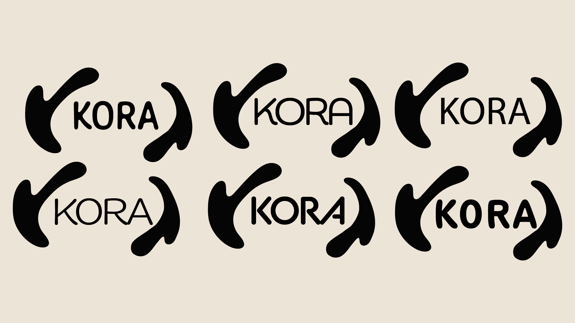
Logo Font Explorations
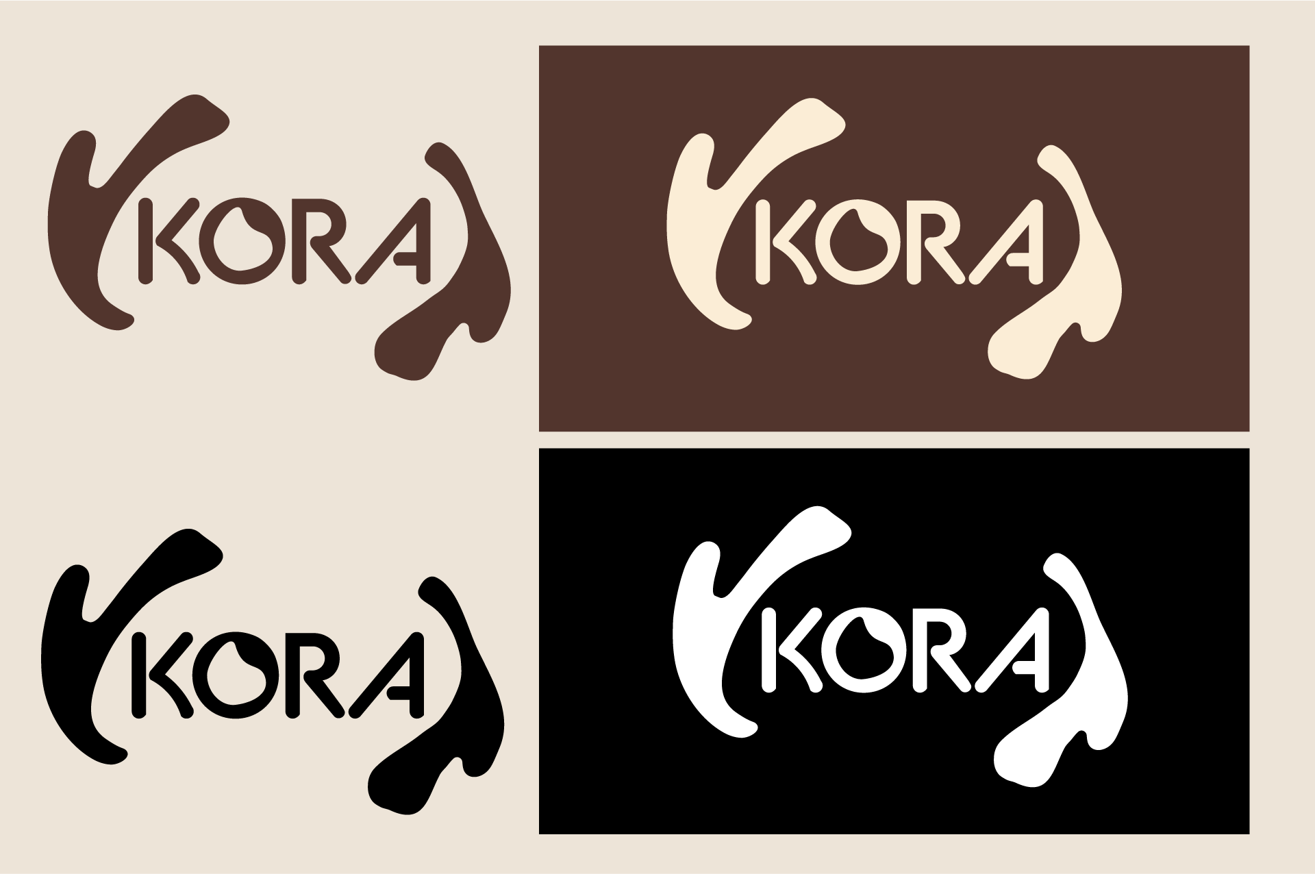
Primary Color Variations
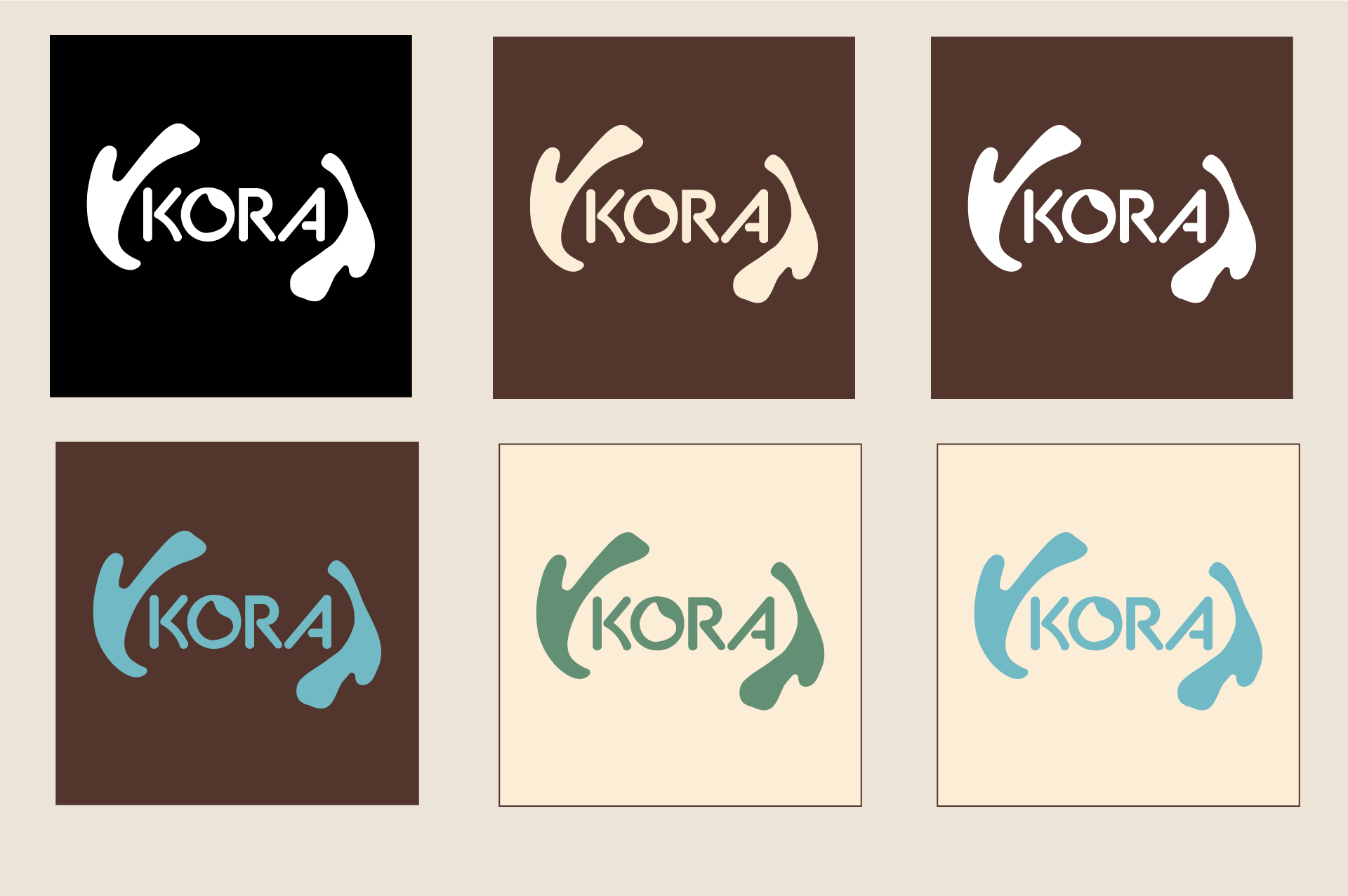
Secondary Color Variations
I designed the logo for Kora based on organic coral shapes that also reflect the motion of rolling waves. For the logo typeface, I wanted a Sans-Serif font that was organic yet had a sporty edge. This led me to choose 'BC Alphapipe' as the typeface for Kora's logo. However, I still wasn't completely satisfied with it, so I redid the O myself, giving it a soft water-droplet shape to reflect the brand.
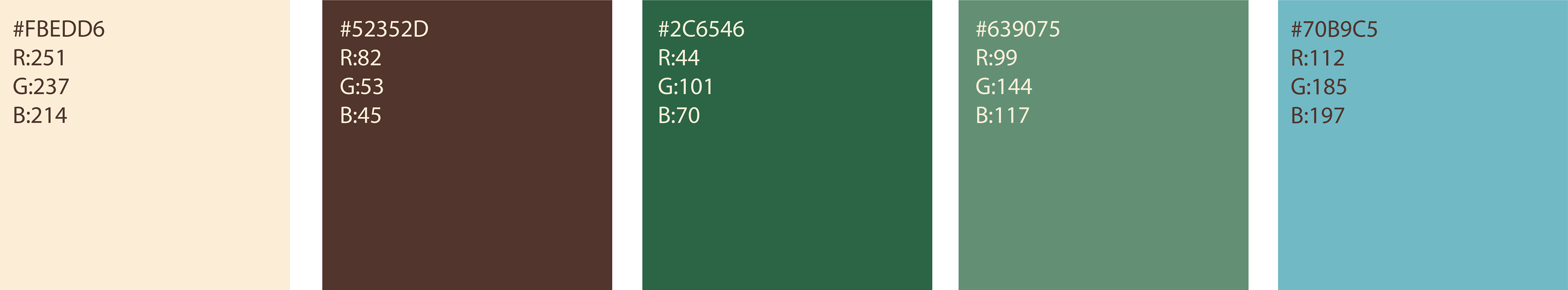
Kora's color palette was directly inspired by colors seen at the beach and in the ocean. Warm sand tones with the varying blue-greens seen in the water. These colors refelct the natural organic vibes of Kora's brand identity.
Brand Elements
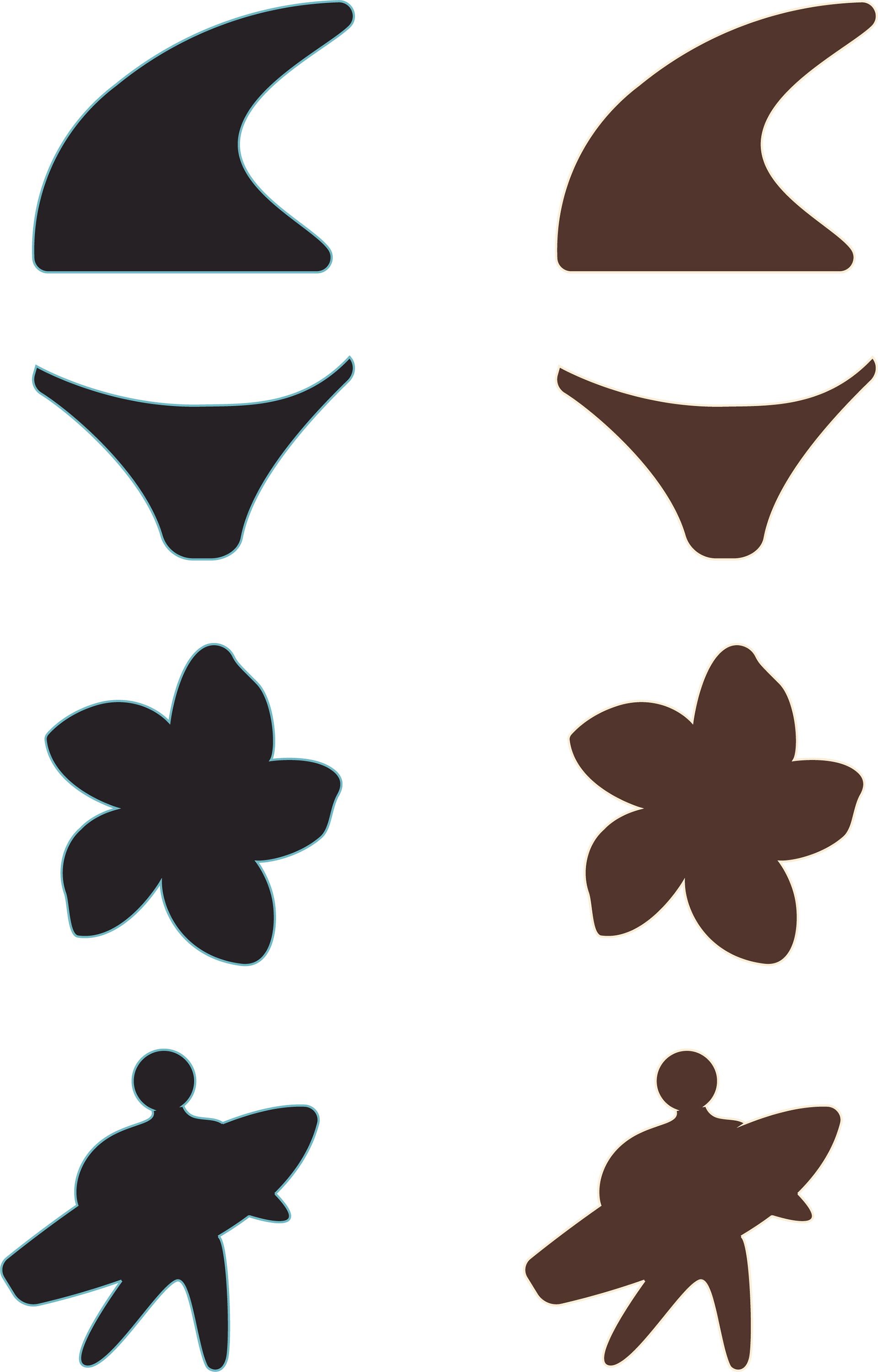
Kora's brand elements were designed to be used as graphics for clothing, advertising, or website icons. Each one representing a key factor of Kora.
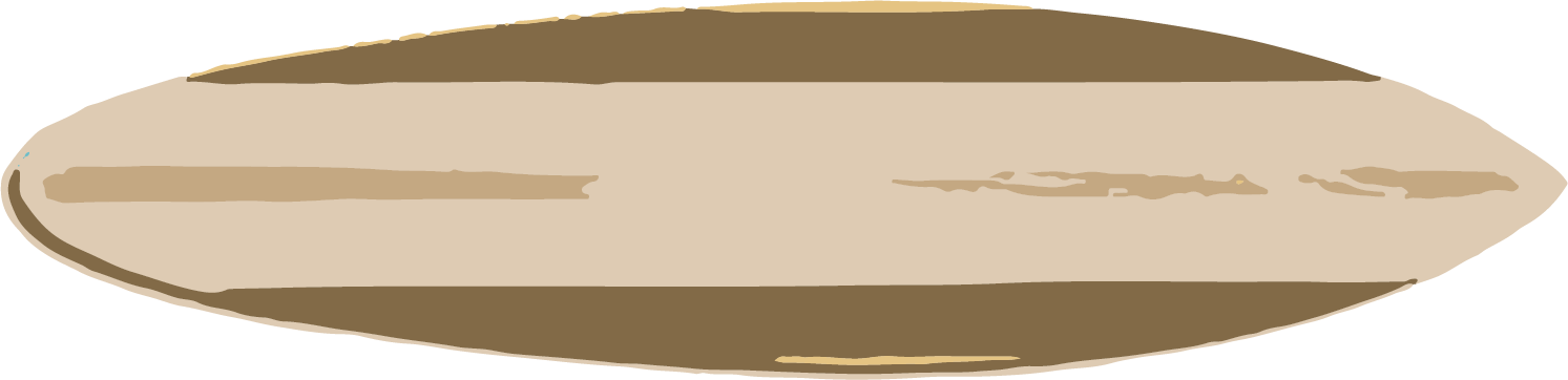
The first icon is a fin of a surfboard representing Koras line of surfing products.
The second icon is a bikini bottom representing Kora's swim line.
The third icon is a plumeria, representin Kora's coastal aesthetic.
The last icon is the surfer crossing icon, commonly seen at cross walks in popular surf locations. This icon represents Kora's dedication to surf as a lifestyle.
Visual Direction
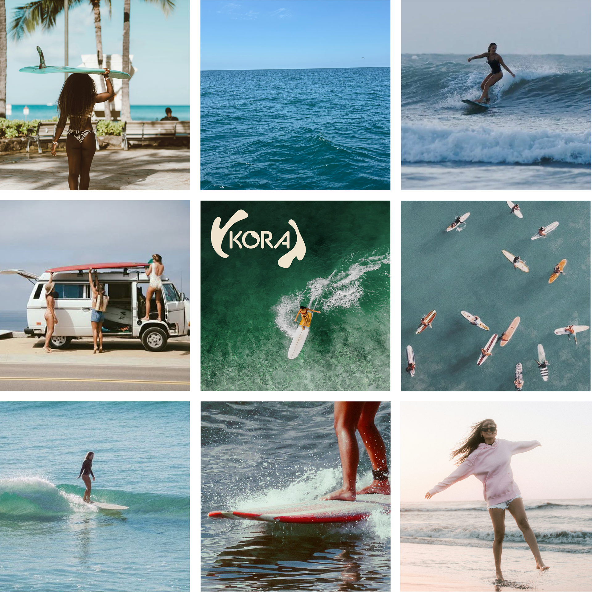
Kora's moodboard features 9 curated photos that perfectly capture the brand's personality. Focusing on the ocean, coastal living, and community.
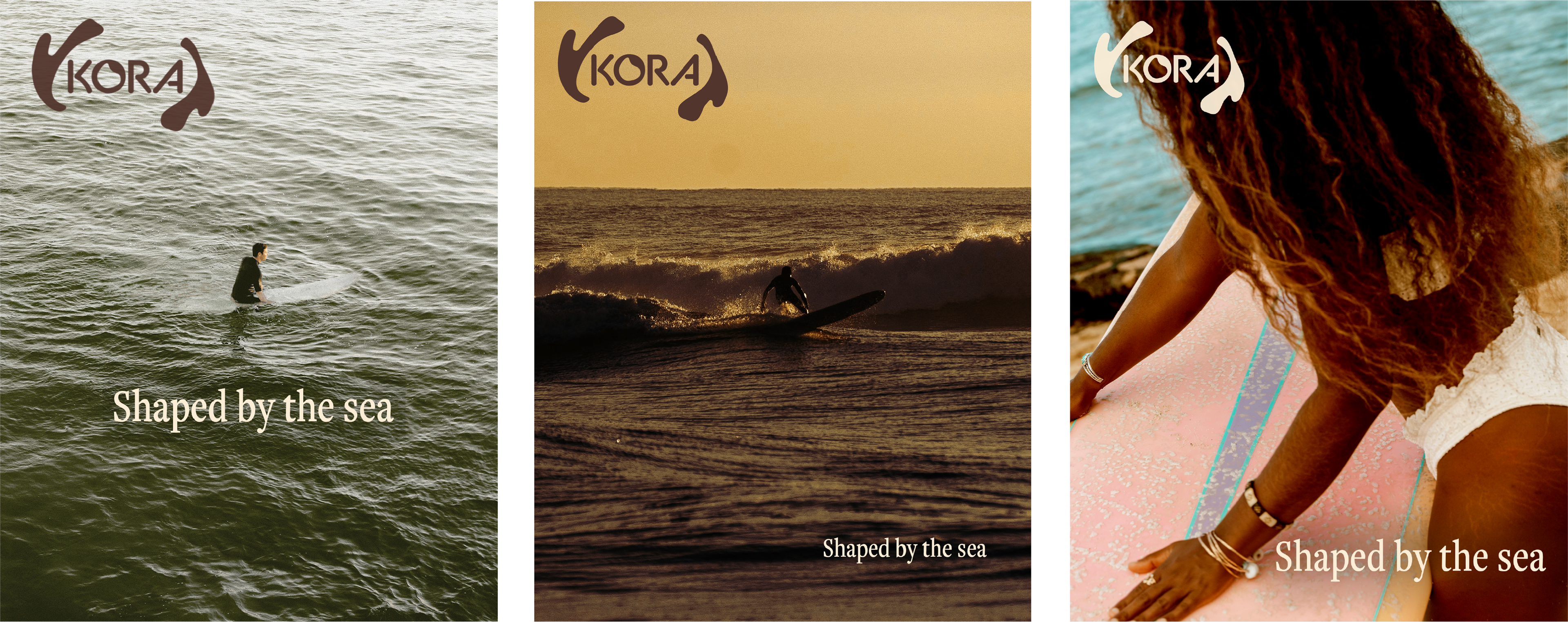
Kora - Shaped by the Sea
'Shaped by the Sea' is a mini-ad campaign using striking images of surf culture. One calm, one in action, and one preparing. These three posters perfectly capture Kora's brand identity and personality.